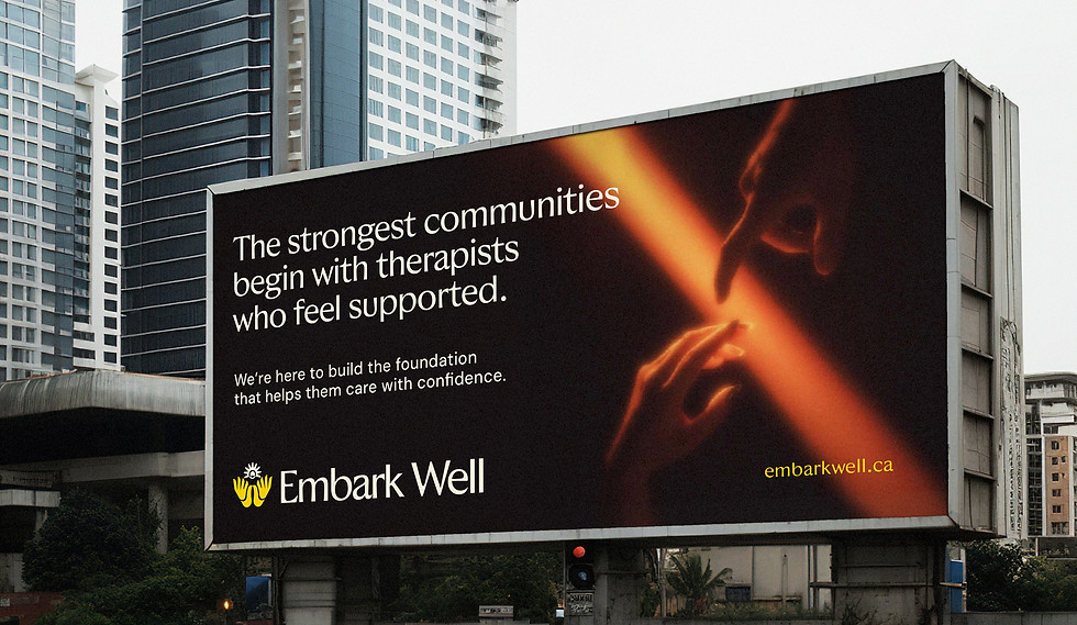
EMBARKWELL
SERVICES
Brand Identity, Brand Strategy.
YEAR
2025
CLIENT
Mental Health,
BIPOC-founded
Designing a brand that supports the people who spend their lives supporting everyone else.
Embark Well exists to strengthen the foundations behind mental health care. Through operational support for Ontario-based therapists and trauma-informed workplace education, they help clinicians build sustainable practices while empowering organizations to create healthier, more inclusive cultures.
As the mission and purpose became clear, the organization needed a visual identity that reflected both the professionalism of its services and the warmth of its mission—positioning Embark Well as a trusted partner for therapists, workplaces, and the communities they serve, for BIPOC folks by BIPOC founders.
How can a mental health brand feel deeply human while maintaining the trust and credibility expected of healthcare?
The identity for Embark Well was built around the philosophy embedded within its name.
Embark speaks to the beginning of a meaningful journey—one filled with intention, optimism, and forward momentum.
Well carries a dual meaning: it represents both health and wholeness, while also evoking the image of a well as a source of nourishment, renewal, and life. Together, the name suggests beginning every journey from a place of preparation, support, and care.
This idea became the foundation of the visual identity.
At the heart of the logo are two abstract forms that read simultaneously as hands and birds. The hands represent the quiet, often unseen support that therapists, caregivers, and communities provide, while the birds symbolize hope, growth, and the courage to take the first step forward. Between them, a central light emerges—an abstract sunrise that represents the spark of healing, resilience, and possibility that exists within each person.
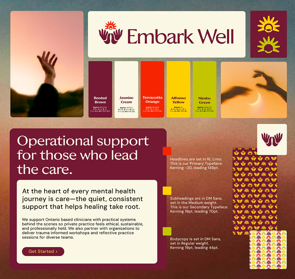
The symmetrical form reflects the balance between structure and compassion that defines Embark Well’s approach. Just as the organization builds thoughtful systems behind the scenes to support ethical and sustainable care, the identity pairs clean geometry and refined typography with soft, organic curves to create a brand that feels both trustworthy and deeply human.
The design process itself reflected this philosophy. Rather than relying solely on internal perspectives, we tapped into Embark Well's community through focus groups to gather honest feedback on multiple creative directions. The final identity resonated most strongly, with participants connecting to the motif of two hands—shaped like birds—coming together to protect and nurture a shared light. It became a powerful expression of the brand’s purpose: supporting those who lead the care, so they can continue helping others heal.

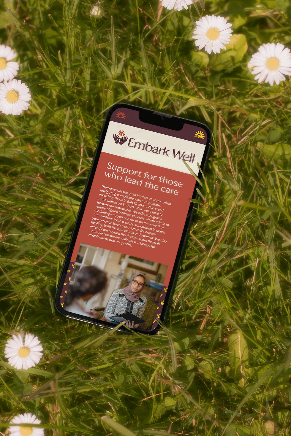


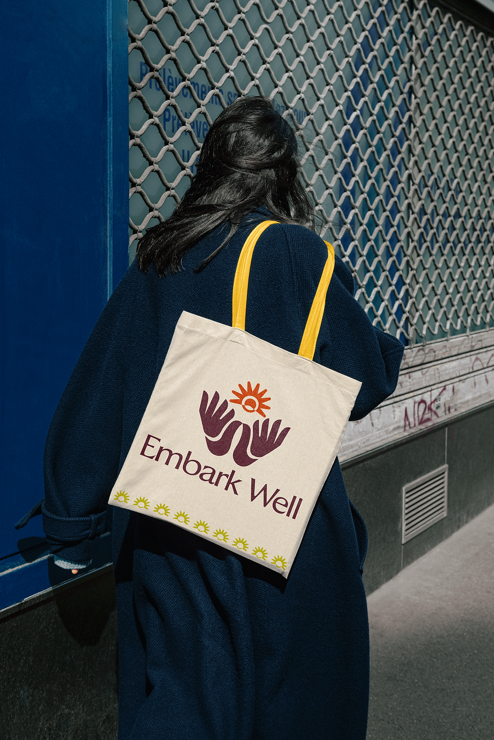
THE RESULT
One of the defining parts of this project was the design process itself.
Rather than relying solely on internal decision-making, Embark Well invited members of its community into the conversation through focus groups, gathering honest feedback on multiple creative directions. This collaborative approach ensured the identity wasn’t simply designed for the community—it was shaped with the people it exists to support.
The final direction emerged as the clear favourite. Participants consistently connected with the symbolism of two hands—formed as abstract birds—coming together to protect and nurture a shared light. It captured the essence of Embark Well’s mission: supporting those who lead the care, so they can continue helping others thrive.
The result is a timeless identity that balances warmth with professionalism, positioning Embark Well as a trusted leader in operational support and mental health education while creating a brand that can grow alongside its expanding community.
THE STRATEGY
Nest & Nurture was built around the idea of care as a complete ecosystem—bridging the gap between medical guidance, nutrition, and lifestyle support for women navigating hormone health.
The strategy centered on creating a brand that felt both credible and deeply compassionate: a trusted space where women could feel supported, informed, and understood through every stage of their health journey.
The name reflects this foundation:
Nest symbolizes safety, grounding, and protection—where healing begins.
Nurture represents the ongoing process of care, growth, and transformation.
Visually, the brand balances science and softness through structured typography, fluid forms, and an energetic blue-teal palette—positioning Nest & Nurture as a modern, trustworthy leader in women’s hormone health.